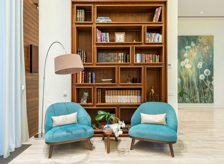
A well-styled bookshelf brings calm and personality to a room. Use a clear color palette, varied heights, and a mix of books, ceramics, framed art, and greenery. Leave breathing room so each object reads like part of a considered composition. Small edits—like grouped books, a sculptural object, and a touch of texture—create a polished, lived-in look.
Choose Your Bookshelf Style First
Before you start styling, decide what kind of bookshelf you want to create: crisp and minimal, warm and collected, or bold and colorful.
Your choice shapes every decision, from open shelving layouts to cabinet display styles, so the whole composition feels intentional.
Should you love a gallery-like look, let a few objects breathe.
Should you want a lived-in mood, mix books, ceramics, and framed art with ease.
For something more dramatic, lean into sculptural pieces and stronger visual rhythm.
Regard the shelf as your signature: it should reflect how you live and what makes you feel at home.
At the point you choose a clear style first, you’ll edit faster, arrange smarter, and create a display that feels like it truly belongs to you.
Pick a Cohesive Bookshelf Color Palette
Start with a neutral foundation—soft whites, warm taupes, charcoal, or natural wood tones—to give your shelves a calm, cohesive base.
Then add a few accent colors in measured hits, like muted green, brass, or deep blue, so the display feels collected, not crowded.
Whenever you repeat those tones across books and decor, you’ll create a polished rhythm that makes every shelf feel intentional.
Neutral Foundation Tones
A neutral foundation gives your bookshelf an easy, cohesive rhythm, letting the collection feel curated instead of crowded. You can build that look with soft neutral bases like warm ivory, oat, taupe, and stone, so every shelf feels connected.
These calming foundation hues let your books, ceramics, and frames share the same visual language, which makes your space feel welcoming and quietly intentional. Whenever you repeat muted tones across spines, baskets, and surfaces, you create belonging without forcing symmetry.
Keep the palette refined and restrained, then let texture do the work: matte paper, woven fiber, smooth ceramic, and aged wood add depth. The result is a polished bookshelf that feels settled, personal, and beautifully easy to live with.
Accent Colors For Contrast
Accent colors give your bookshelf the spark that keeps a neutral foundation from feeling flat, and you can use them to guide the eye with purpose.
Choose two or three hues that echo your room’s textiles, artwork, or ceramics, then repeat them in books, vases, and framed objects. Those color pop accents create rhythm without overwhelming the shelves, while contrasting decorative highlights add dimension against wood, linen, or matte black finishes. Place the brightest cues near eye level or at shelf ends to frame the display with confidence. Should you want a more collected feel, mix one saturated shade with softer companions so the palette feels personal, polished, and easy to belong in. Keep the balance airy, and your shelves will feel curated, not crowded.
Mix Bookshelf Decor With Books
Mixing bookshelf decor with books gives your shelves depth, personality, and a more collected feel. You can build book and decor layering using pairing favorite titles with ceramics, framed art, or a sculptural bowl, then editing until each zone feels intentional. Aim for curated shelf vignettes that reflect your taste and make your home feel like it belongs to you.
| Books | Decor | Effect |
|---|---|---|
| Stack | Vase | Polished |
| Line up | Frame | Editorial |
| Cluster | Candle | Inviting |
| Group | Object | Personal |
Repeat a color family, mix matte and glossy finishes, and leave a few visual pauses so the display breathes. Whenever you combine books with meaningful objects, your shelves feel styled, lived-in, and unmistakably yours.
Use Height and Layers for Balance
You can create a more balanced shelf by mixing tall vases or stacks with shorter objects that let the eye move naturally across each level.
Pull books slightly forward and layer smaller accents in front to add depth without crowding the space.
The contrast between high and low pieces gives your bookshelf a polished, collected look.
Vary Object Heights
Varying object heights keeps a bookshelf from feeling flat, so start with anchoring each shelf with taller pieces like vases, framed art, or stacked books, then layer shorter accents in front and beside them for depth. You’ll create object height contrast that feels intentional, not random, and sculptural height pairings that read as curated and calm. Consider in thirds: tall, medium, low.
| Tall | Medium | Low |
|---|---|---|
| Vase | Candle | Stone |
| Art | Bowl | Trinket |
| Books | Frame | Box |
Repeat the rhythm across shelves so your display feels connected. Keep negative space between groups, and let one bold silhouette lead the eye. That balance helps your bookshelf feel like it belongs in a thoughtfully styled home.
Layer Books Forward
When you want a shelf to feel layered rather than flat, pull a few books forward so they overlap each other and the objects around them.
This simple shift creates book cover layering that reads intentional, not crowded.
Let one volume sit slightly ahead of the stack, then angle a favorite title in a front facing display to draw the eye.
You’ll add depth without losing order, and your shelf will feel curated, lived-in, and welcoming.
Pair the forward books with a small vase or framed photo tucked behind them, so each piece supports the next.
Keep the arrangement edited and calm; the goal is a polished vignette that feels like it belongs to you, and invites others in.
Mix Tall And Short
- Place a tall vase beside a horizontal book stack.
- Add a petite candle or ceramic in front.
- Repeat the pattern across shelves for visual flow.
You don’t need symmetry; you need contrast that lets each piece breathe. Whenever you mix heights thoughtfully, your shelf feels layered, polished, and welcoming, like a space where your style belongs. Keep editing until the arrangement feels easy, refined, and quietly personal.
Add Greenery to Soften the Shelf
Even a small stem can soften a bookshelf and keep hard edges from feeling too rigid. You can tuck indoor plant accents between books and objects to bring a fresh, lived-in glow to the shelf. Choose a compact pot with sculptural leaves, or let trailing vine styling spill gently over an edge for movement that feels effortless.
The greenery breaks up dense rows, adds organic texture, and makes your display feel more welcoming. Place one plant near a stack or beside a frame so it reads as intentional, not crowded. Whenever light is limited, use realistic faux stems and still get that lush effect. Whenever you repeat greenery across the bookcase, you create a calm rhythm that feels curated, relaxed, and unmistakably yours.
Style Books by Color or Size
Grouping your books via color or size can instantly make a bookshelf feel more intentional and polished. You’ll create a look that feels curated, not accidental, and it’ll help your space feel like it belongs to a thoughtful home. Try:
- color family grouping for a calm, cohesive palette
- size sorted book stacks to build clean lines and rhythm
- alternating vertical rows with horizontal stacks for visual balance
Whenever you group similar tones together, the shelf reads like a styled vignette, especially whenever you repeat hues across levels.
Size sorting works beautifully too, because it gives your display structure and makes your favorite titles feel collected. Add a few sculptural accents nearby, and your books will anchor the whole composition with quiet confidence.
Leave Some Empty Space on Shelves
Leaving a few shelves partially open gives your bookcase room to breathe and makes the whole display feel more intentional. You don’t need every inch packed to look styled; a well-placed gap creates intentional breathing room that spotlights your best pieces.
Use negative space styling to let a favorite stack, framed print, or sculptural object stand out with quiet confidence. Whenever you edit with restraint, your shelves feel curated, calm, and welcoming, like they belong in a thoughtfully lived-in home.
Try balancing fuller shelves with lighter ones so the eye can move naturally across the grid. That open area can also soften strong lines, making your collection feel collected, not crowded.
Mix Materials for More Texture
Mixing materials is one of the easiest ways to give your shelves depth and character. You can create mixed material contrast that feels collected, not crowded, using pairing smooth books with woven, matte, and reflective pieces.
Consider of your shelves as a small style story that welcomes you in.
- Add a ceramic vase beside stacked hardcovers.
- Place a woven basket under a glossy object for tactile shelf accents.
- Repeat wood, stone, or metal finishes across shelves to keep the look cohesive.
When you vary surfaces, your display gains warmth and dimension without losing polish. You’ll build a bookshelf that feels personal, balanced, and effortlessly refined—like it belongs in your space and nowhere else.
Add Art and Frames for Personality
After you’ve mixed in texture, art and frames can bring your shelves to life with a more personal, collected feel. You can create a curated story with gallery inspired framing, then soften it with leaning art layers behind books and objects. Use frames in a slim finish, then repeat one metal or wood tone so the shelf feels connected and welcoming.
| Piece | Placement | Effect |
|---|---|---|
| Small print | Leaned at back | Adds depth |
| Frame cluster | Center shelf | Creates rhythm |
| Mini art card | Beside books | Feels intimate |
Anchor one frame, then build around it with a vase or stack of books. Keep spacing intentional, so each piece has room to breathe. Whenever you edit with care, your shelves feel like they belong to you.
Refresh Your Bookshelf Each Season
To keep your bookshelf feeling fresh, swap in seasonal color accents that echo the mood outside your window.
You can shift textures too—think lighter ceramics in spring, woven details in summer, richer woods or metals in fall.
Rotate a few decorative objects each season so the shelf always feels curated, current, and polished.
Seasonal Color Swaps
As the seasons change, you can give your bookshelf a fresh look using swapping in colors that echo the moment—soft neutrals and airy textures for spring, sun-warmed tones for summer, rich earthy hues for fall, and deeper, moodier accents for winter. Seasonal palette swaps help your shelves feel current without a full redesign, and holiday accent rotations keep the look festive yet polished.
- Spring: pair cream, sage, and pale blue with clean book stacks.
- Summer: add coral, ochre, and sea-glass touches for a brighter vibe.
- Fall and winter: move in rust, forest, navy, or plum.
Repeat one hue across vases, book spines, and frames so your display feels connected. You’ll create a homey, collected look that feels like it belongs to you.
Textural Accent Changes
Once you’ve refreshed your color palette, switch up the textures to keep your bookshelf feeling seasonal and intentional.
You can trade glossy accents for matte ceramics in cooler months, then bring in woven textile layers as the weather warms. A folded linen runner, a boucle box, or a rattan tray adds tactile surface contrast without crowding the shelves.
Mix smooth book jackets with rough-hewn wood, ribbed glass, or stone so your display feels layered and lived-in. Keep the palette restrained so the materials shine, and repeat one texture across shelves to create cohesion.
These subtle shifts help your bookcase feel curated, current, and welcoming, like it belongs to someone with impeccable taste.
Rotating Decorative Objects
As the seasons shift, swap out a few decorative objects so your bookshelf feels fresh without a full redesign. Your seasonal object rotation can keep the room feeling current, collected, and unmistakably yours. Anchor the shelf with books, then layer in collectible accent swaps that echo the mood outside.
- In spring, place a small vase, a crystal, or a framed print beside lighter books.
- In summer, trade in one ceramic or travel memento for a brighter, airy piece.
- In fall and winter, bring back deeper tones, sculptural objects, or a candle for warmth.
Keep the rest steady so your display still belongs to your everyday life. Through rotating a few objects, you’ll create a polished rhythm that feels intentional, welcoming, and easy to live with.
Avoid Common Bookshelf Styling Mistakes
Even the most beautiful bookshelf can fall flat should you overcrowd it, ignore scale, or let every shelf compete for attention. You’ll sidestep common styling pitfalls through editing with intention and avoiding overcrowded shelves. Start with a few anchors, then layer lighter pieces around them for balance.
| Mistake | Better move |
|---|---|
| Too many objects | Edit to a tight edit |
| Random scale | Mix tall and low pieces |
| Flat rows | Alternate stacks and gaps |
Keep your palette cohesive, repeat one finish or color, and let negative space breathe. Use books as risers, place a vase or frame with confidence, and step back to check the silhouette. Upon each shelf feels edited, you create a polished display that feels welcoming, current, and unmistakably yours.