
Professional lettering punishes the wrong tool fast. A nib that skips mid-stroke or ink that feathers on cardstock can undo an hour of careful work, which is why working calligraphers tend to be picky about what sits in their pen roll. This roundup sorts seven options built for serious practice: brush pens for modern scripts, a classic dip set for Italic and Gothic hands, and markers that pull double duty in journals and client mockups. Each entry covers where it performs, where it doesn’t, and the kind of letterer it suits.
A Side-By-Side Look

GETHPEN Calligraphy Brush Pen Set Black Archival Ink

Kuretake Bimoji Brush Pen 5-Piece Set

Speedball C-Series Lettering Pen Set with 6 Nibs

Wonwood_direct 7-Pc Fountain Calligraphy Set 11 Colors
Itoya Double Header Calligraphy Marker Black

Itoya Double Header Calligraphy Marker Purple

Itoya Double Header Calligraphy Marker Red
What Each Pick Brings To The Table
Eight tips in one box cover nearly every stage of learning: 1mm, 2mm, and 3mm points alongside extra-fine, fine, medium, brush, and soft brush options. That spread matters because stroke width is the first thing you experiment with, and swapping barrels beats buying singles one at a time.
The pigmented black ink is water-based and fadeproof, so finished pieces hold up on display or in a portfolio. For anyone practicing faux-calligraphy at a kitchen table after work, this set removes most of the guesswork about which tip to try next.
Why It Works Well
- Eight distinct tip sizes let you move from hairline flourishes to broad brush strokes without another purchase
- Fadeproof pigment keeps signed prints and framed pieces looking fresh over time
- Non-bleeding formulation behaves well on standard sketchbook paper, not just premium stock
- One consistent black across all eight pens makes practice sheets look uniform
A Few Limitations
- Water-based ink needs a moment to dry before erasing pencil guides underneath
- Brush tips reward a light hand; heavy pressure shortens their lifespan noticeably
Key Specs
Who Should Grab It
Newcomers who want a complete tip range in one affordable kit rather than piecing together singles.
Another Choice May Suit
Letterers ready for a firmer, more traditional feel will prefer the Kuretake Bimoji five-piece set, whose bamboo-style barrels suit illustration work too.
Made in Japan by a company with deep brush-making roots, the Bimoji line takes its cues from traditional fude brushes, and the barrels even echo that bamboo heritage visually. The five-tip spread runs from extra-fine through large, plus a medium brush for expressive swells.
Where the GETHPEN set above leans beginner, this one rewards developing control: the hard fine tip holds a crisp edge for detailed strokes, something soft tips blur. Rubberized grips keep fingers steady during long practice sessions, a small detail you notice around page forty of drills.
What Works In Its Favor
- Firm brush tips give predictable feedback, which speeds up muscle-memory building
- Rubber grip sections resist slipping during humid summer sessions or long marathons
- Doubles cleanly as an illustration tool for manga-style linework and shading
- Five sizes span delicate captions to poster-scale headlines
Points To Note
- Only one color family per purchase, so multi-color layouts mean buying additional sets
- Firm tips demand lighter pressure than soft brush pens; press hard and the point splays
Whose Shelf It Belongs On
Intermediate letterers and illustrators who want Japanese brush feel and crisp tip control in daily rotation.
Swap It Out When
Total beginners still finding their pressure may get more mileage from the GETHPEN set’s softer, more forgiving tips first.
This is the old-school route: six square-cut C-series dip nibs (C0 through C5) plus one holder. Dip nibs differ from cartridge pens because you load each stroke manually, which sounds tedious until you realize it means unlimited ink choice and razor-sharp edges no felt tip matches.
For Roman Gothic, Italic, scrollwork, and accenting line drawings, these broad-edge nibs remain a studio staple. The trade-off shows up at events or cafés: an open ink bottle and slow rhythm make this a desk tool, not a travel one.
What Helps Most
- Six graduated widths handle everything from fine Roman capitals to chunky Gothic blackletter
- Metal nibs outlast disposable tips by years when rinsed after sessions
- Works with any bottled ink, opening up metallics and custom mixes
- The sharp square edge produces the crisp thicks-and-thins that define formal alphabets
Things That May Matter
- Requires dipping rhythm and cleanup after every sitting, unlike capped markers
- Beginners often find the learning curve steeper than brush pens
- No ink included, so budget for a bottle separately
Feature Snapshot
Right Fit For
Working calligraphers producing formal pieces, wedding signage, or traditional alphabets at a dedicated desk.
Reach For A Different Pick When
Portability wins, the Itoya Double Header markers travel far better, capping safely in a bag between appointments.
Seven fountain pens, seven italic nib widths from a hairline 0.5mm all the way to a sweeping 2.9mm, forty cartridges across eleven colors, and six plunger converters. Few kits at any level pack this much range into one box, and the converter option means you’re never chained to proprietary cartridges.
Italic nibs (cut at an angle) create thick downstrokes and thin crossstrokes automatically, which makes them satisfying for beginners chasing that classic contrast. Color variety turns practice sheets into something you actually want to keep, a small motivational edge over single-black kits like the Speedball.
Real Benefits
- Seven graded italic nibs let you match width to project scale instantly
- Eleven ink colors support greeting cards, envelopes, and color-coded practice
- Dual refilling via cartridges or converters gives both convenience and economy
- Capped fountain design travels more cleanly than open dip setups
Honest Caveats
- Cartridge pens need occasional nib flushing to prevent dried-ink clogs, especially after storage
- Entry-level nib polish varies unit to unit, per widely reported owner feedback
The Numbers That Matter
Who Will Love This
Hobbyists and journaling enthusiasts who want color variety and italic contrast without committing to dip-pen ritual.
Not Your Match When
Calligraphers needing archival black for client deliverables will find the GETHPEN set’s fadeproof pigment a safer bet.
Two firm chisel points, 1.5mm and 3mm, share one barrel, and the caps nest so switching widths takes a second. That double-header layout is why this marker earns permanent pocket space: one tool covers both caption text and headline weight in a bullet journal spread.
The black lays down richly on most papers, and the rigid chisel edge produces cleaner serifs than flexible brush tips once your angles are trained. Compared with the Wonwood_direct fountain set, there’s zero maintenance here, cap it and go, though you also give up refillability.
What Pays Off
- Twin tips in one barrel halve what you carry to workshops and cafés
- Nesting caps prevent lost ends and speed mid-page size changes
- Firm chisels hold their edge shape far longer than fiber brush points
- Deep black reads boldly on light and mid-tone papers alike
Small Caveats
- Only two fixed widths, no fine-point option for tiny annotations
- Markers aren’t refillable, heavy users cycle through them faster than fountain pens
Made For
Journalers, students, and working designers who want dependable everyday lettering with no prep or cleanup.
Look Elsewhere When
Broader width ranges matter more than convenience, the Speedball C-Series delivers six graduated metal nibs instead.
Same dual-chisel body as the black version above, dressed in a violet ink that suits wedding stationery, spring spreads, and card making. The water-based formula is acid-free, which matters for anything destined for scrapbooks, since acid-heavy inks yellow paper over years.
Ittoya lists compatibility beyond paper too: wood, plastic, stone, metal, rubber, and cardstock all take the ink. In practice, porous surfaces like raw wood drink it best, while slick plastics stay smudge-prone until fully dry, worth a test swipe before committing to a finished piece.
Advantages To Know
- Acid-free ink protects keepsake albums and heirloom projects from long-term discoloration
- Adheres to wood, cardstock, stone, and more, expanding past paper crafts
- Non-toxic water base keeps it comfortable for shared craft tables and classroom use
- Vibrant purple pairs well with gold accents on invitation suites
Worth Bearing In Mind
- Water-based ink isn’t waterproof, moisture smears finished lettering
- Recap tightly after use or the chisel tips dry at the edges
Who It Suits Best
Paper crafters and card makers adding elegant colored script to keepsake projects.
Consider Something Else When
Neutral, archival black lettering is the goal, the black Itoya marker or the GETHPEN brush set fit better.
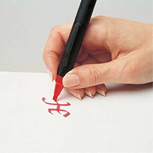
Rounding out the trio, this red variant carries the same two sharp-edged chisels, 1.5mm and 3mm, with a saturated red laydown that pops against white and cream stock. Red earns its place as an accent color: envelope addresses, calendar headers, correction notes, holiday cards.
Like its purple sibling, it’s non-waterproof, so finished work stays indoors away from damp. The nested-cap design and instant-dry rhythm make it the kind of marker you grab without thinking, which is exactly the role an accent color should play in a professional kit.
Where It Excels
- Rich red saturation stands out sharply for headings and emphasis lines
- Both chisel edges stay crisp for clean serif terminals
- Performs consistently across most common paper weights
Details To Watch
- Non-waterproof ink rules out outdoor signage or damp environments
- Two widths only, fine annotation work needs a separate liner pen
Core Details
Built With In Mind
Designers and planners using red accents for calendars, proofs, and seasonal correspondence.
Where A Sibling Pick Shines
Long-form brush lettering calls for the Kuretake Bimoji set instead, whose flexible tips handle expressive stroke variation better.
Choosing Between Nib Types Without Regret
Match The Tool To Your Script Style
Broad-edge nibs, like the Speedball C-series, produce the angular thicks and thins of Italic, Roman Gothic, and uncial hands. Brush and flexible tips suit modern calligraphy and bouncy lettering, where stroke contrast comes from pressure rather than angle. Buying against your target alphabet is the fastest way to waste money.
Think About Where You Actually Work
Dip pens demand a desk, an ink bottle, and patience; they shine in a studio and fail at a coffee shop. Cartridge fountain pens and capped markers travel well and start instantly. Commuters and workshop attendees should weigh portability as heavily as line quality.
Paper Changes Everything
Feathering and bleed-through ruin good tools’ reputations unfairly. Smooth, sized papers flatter fine nibs, while textured stock suits broad edges and brush pens. Test any new pen on the paper you actually use before judging its performance.
Key Considerations Across These Picks
Traps First Timers Fall Into
Chasing tip count over quality is the classic error; twelve mediocre nibs teach worse habits than three good ones. Skipping ink-type research causes heartbreak later, since water-based markers smear near moisture while pigmented inks resist fading. Also, many newcomers overlook maintenance entirely, and dried ink claims more nibs than wear ever does.
What Separates Premium From Basic
Higher-tier sets invest in tip machining, grip ergonomics, and ink chemistry, which translate directly into cleaner edges and longer usable life. Japanese-made brush pens like the Bimoji line exemplify this: firmer fibers, tighter tolerances, steadier flow. Paying up pays off once lettering becomes weekly work rather than occasional curiosity.
Frequently Asked Questions
Are brush pens suitable for professional calligraphy work?
Yes, especially for modern scripts, signage, and illustration crossover work. Traditional alphabets like Copperplate or Gothic still favor broad-edge or pointed metal nibs.
Do I need different pens for left-handed lettering?
Left-handers often struggle with angled nibs designed for right-hand pull strokes. Left-handed oblique nibs and faster-drying inks solve most of the friction.
How long do calligraphy marker tips last?
Firm chisel tips typically hold their edge for months of regular use with proper recapping. Flexible brush tips wear faster under heavy pressure, sometimes within weeks of daily drills.
Can I mix brands of ink cartridges and pens?
Cartridge fittings vary by manufacturer, so cross-brand refills rarely seat correctly. Converters sidestep the problem by letting you fill from any bottled ink.
What’s the best starter pick among these seven?
The GETHPEN set offers the widest tip range at a gentle price, making mistakes cheap. Add the Speedball C-series once formal alphabets enter your practice plan.
Bottom Line
Your ideal pick depends less on rankings and more on the letters you want to write. Modern brush lettering points toward the GETHPEN or Kuretake sets, formal alphabets justify the Speedball’s dip-pen ritual, and colorful everyday work favors the Wonwood_direct fountain kit. The Itoya markers slot in as low-maintenance companions for journals and accents. Start with the style you love, and the right pen follows naturally.
