
Lettering projects live or die by the tool in your hand. A nib that skips mid-stroke or ink that feathers through cheap paper turns practice sessions into frustration fast. This roundup sorts through cartridge-fed parallel pens, brush pens, and a fude fountain pen so you can match the right tool to your style, whether you’re addressing wedding envelopes or sketching in a journal every evening.
Your Options, Compared

Pilot Parallel Calligraphy Pen Set 2.4mm Nib (90051)

Pilot Parallel 4 Nib Calligraphy Pen Set (90078)

Pilot Parallel Pen Premium Caligraphy Pen Set 3.0mm (14679)

Pilot Parallel Pen Premium Caligraphy Pen Set 4.5mm (14682)

GETHPEN Calligraphy Brush Pen Set, Black Archival Ink
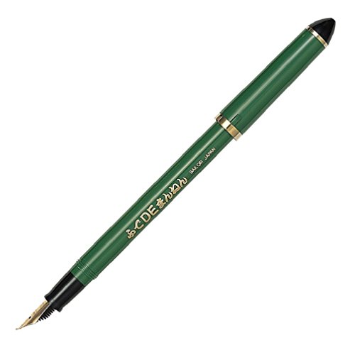
Sailor Fude De Mannen Calligraphy Fountain Pen Bamboo Green

Kuretake Bimoji Brush Pen, 5 pcs set
A Breakdown Of The Leading Choices
The 2.4mm width sits in the sweet spot of Pilot’s Parallel line: wide enough for italic capitals, narrow enough that lowercase stays legible at everyday sizes. Its nib uses two parallel plates instead of a traditional cut tip, which produces crisp edges that conventional calligraphy nibs struggle to match.
In daily practice, this is the pen most people reach for when learning foundational hands. The cartridge system means no dipping, no mess on the desk, and quick restarts after interruptions.
The Case For It
- Parallel-plate nib design delivers sharper stroke edges than standard calligraphy pens
- Swapping black and red cartridges inside the barrel creates gradated two-tone lines
- Includes a pipette and nib cleaner, so maintenance starts day one
- Cartridge feed keeps long practice sessions clean and interruption-free
Honest Caveats
- One nib width limits you until you buy additional sizes
- Owners commonly report the nib needs rinsing between sessions to prevent dried ink buildup
Key Specs
Who It Suits Best
Learners working through italic, uncial, or gothic hands who want one reliable pen rather than a whole drawer.
A Better Fit Elsewhere
Anyone wanting multiple widths from the start should step up to the Pilot Parallel 4 Nib Calligraphy Pen Set, which bundles four sizes together.
This bundle takes the single 2.4mm pen reviewed above and multiplies it into a complete workshop. You get four pens carrying 1.5mm, 2.4mm, 3.8mm, and 6.0mm nibs, which spans delicate copperplate-style flourishes up to bold poster headings without touching another tool.
For classroom settings or study groups, having four matched pens means consistent feel across every size. Eight cartridges ship in the box, four black and four red, so each pen arrives ready to write immediately.
Features That Help
- Four nib sizes eliminate guesswork about which width fits which script
- Cartridge swapping between pens enables mixed-color gradation effects
- Eight included cartridges keep all four pens writing out of the box
- Same parallel-plate nib technology as the single-pen set, just scaled across sizes
Things To Consider
- Four pens take up more desk and case space than a solo carry
- The 6.0mm nib demands large paper formats; small notebooks will cramp it
- Dried ink in any unused pen means a cleaning session before its next outing
Built With In Mind
Committed students, calligraphy instructors, and workshop hosts who need a full size range on hand.
Swap It Out When
Occasional hobbyists will find the single-nib Pilot Parallel 2.4mm set covers their needs at a lower commitment level.
Pilot’s premium line dresses the same parallel-plate nib engineering in a white barrel with pink accents, and the result reads far more gift-worthy than the standard translucent bodies. The 3.0mm nib lands between the classic 2.4mm and wider display sizes, giving slightly bolder letters without overwhelming greeting-card layouts.
You may find this width especially comfortable for envelope addressing, where a touch more presence helps names stand out. Two cartridges, black and red, come loaded for immediate use.
Reasons It Performs
- White-and-pink styling makes it a natural present for creative friends
- 3.0mm nib splits the difference between fine text work and display lettering
- Refillable design supports ongoing use with separately sold cartridges
- Color-blending trick works here too: park two cartridges in the barrel for gradient strokes
Small Caveats
- Light-colored barrels tend to show ink stains from refilling mishaps
- Single-width purchase again, unlike the four-pen Pilot Parallel set
Right Fit For
Gift shoppers and intermediate letterers who want a distinctive-looking pen with a moderately wide nib.
Where A Sibling Pick Shines
Writers chasing dramatic poster-scale strokes should look at the teal-accented Pilot Parallel Premium 4.5mm set instead.
Wide nibs are specialist tools, and the 4.5mm version of Pilot’s premium Parallel pen embraces that role. Signage, chalkboard-style menus, large quote prints: these are the jobs where narrow nibs disappear and this teal-accented white body earns its place. The parallel plates hold crisp edges even at this generous width, which cheaper broad nibs rarely manage.
Expect to work on A4 sheets or larger for most compositions. On standard notebook paper, letters simply won’t fit the page height.
What Makes Sense
- 4.5mm width produces bold, high-impact strokes suited to display pieces
- Teal accents give the premium barrel a distinct identity among Pilot’s lineup
- Accepts refillable Parallel cartridges, including dual-cartridge color blending
Points To Note
- Too wide for journals, planners, or standard correspondence
- Requires larger paper stock, an added recurring cost for heavy users
- Beginners often report control challenges at this scale before wrist technique develops
Whose Shelf It Belongs On
Sign painters, event stationery creators, and anyone producing large-format lettered artwork regularly.
Reach For A Different Pick When
Everyday note-taking and card-sized projects suit the pink-accented 3.0mm Pilot Parallel Premium far better.
Where the Pilot pens write with rigid metal nibs, this GETHPEN set goes fully flexible: eight pens covering 1mm, 2mm, 3mm, extra-fine, fine, medium, brush, and soft brush tips. That range lets you experiment with modern brush lettering styles without committing to any single tool first.
The water-based pigmented black ink is waterproof once dry and resists fading, which matters for artwork destined for frames or sketchbooks that get handled often. No bleeding through typical marker paper, per the manufacturer’s claims, though thin notebook pages can still be unforgiving.
Benefits That Matter
- Eight distinct tip types let you sample every major lettering technique in one kit
- Pigmented, fadeproof black keeps finished pieces looking fresh over time
- Waterproof drying means highlighter passes and watercolor washes won’t smudge your linework
- Brush and soft-brush tips reward pressure control, building skills transferable to real brushes
Trade Offs To Consider
- Flexible tips wear down faster than metal nibs under heavy pressure
- These are disposable pens; refills aren’t part of the design
- Only black ink, so colorful work requires separate supplies
Who Will Love This
Total beginners exploring hand lettering, plus bullet-journal enthusiasts who want variety without a big investment.
Not Your Match When
Traditionalists practicing formal italic scripts will get truer results from the Pilot Parallel 2.4mm set’s rigid nib.
Sailor’s Fude De Mannen (“brush-like pen”) bends fountain pen convention with a 55-degree angled nib. Hold it normally and you get a fine line; rotate the barrel and lay the tip flatter, and the stroke widens dramatically. Line variation comes from angle rather than pressure, which many writers find gentler on the hand during long sessions.
The bamboo-green barrel suits desk display as much as daily use, and Sailor’s Japanese build quality shows in the nib machining. As a bonus for tinkerers, it accepts bottled ink via converter, opening up an entire palette beyond cartridges.
A Few Highlights
- 55-degree fude nib creates variable line weight purely through writing angle
- Easier grip and control than an actual brush, per the design intent
- Fountain pen filling means economical bottled ink options over time
- Distinctive bamboo-green finish stands apart from standard black barrels
Less Ideal Details
- Angled nib takes adjustment if you’re used to conventional fountain pens
- No cartridges included, so plan an ink purchase alongside the pen
- Line variation depends on technique, and some owners report a learning curve of several weeks
Best Suited To
Fountain pen enthusiasts and casual calligraphers who enjoy expressive, angle-driven strokes in a journal or sketchbook.
Another Choice May Suit
Structured script learners wanting predictable stroke widths will prefer the Kuretake Bimoji set’s controlled brush tips.
Kuretake has made brush pens in Japan for decades, and the Bimoji five-piece set reflects that heritage. Extra fine, fine, medium, large, and medium brush tips arrive styled after traditional bamboo brushes, with rubberized grips that resist slipping during detailed work.
The hard-tipped fine variant handles precise illustration linework, while the medium brush rewards confident strokes for larger characters. Compared to the GETHPEN eight-pen kit, you trade two tip options for a more refined Japanese build that many artists consider worth it.
Useful Touches
- Five graduated tip sizes cover caption notes through headline lettering
- Rubber grips stay comfortable and secure during extended drawing sessions
- Bamboo-brush aesthetic connects modern tools to traditional calligraphy roots
- Suits both practice drills and finished illustration work equally well
Worth Bearing In Mind
- Five pens cost more per tip than budget multipacks offer
- Tips are consumable; frequent heavy pressure shortens usable life
Quick Facts
Made For
Illustrators, comic artists, and lettering practitioners who want dependable Japanese quality across multiple tip sizes.
Consider Something Else When
Budget-conscious beginners testing the waters will get more tip variety per dollar from the GETHPEN brush pen set.
Choosing Between These Pens Without Regret
Nib Type Shapes Everything
Rigid parallel nibs, like Pilot’s, produce uniform stroke widths ideal for formal italic and gothic scripts. Flexible brush tips, like GETHPEN’s and Kuretake’s, respond to pressure and suit modern hand lettering. Decide which style of writing you actually want before comparing anything else, because the two categories barely overlap in feel.
Match Width To Your Paper
A 6.0mm nib needs A4 or larger sheets; anything smaller cramps the letterforms. Journal users should stay at 3.0mm or below, or choose a brush pen entirely. Measure the writing area you use daily, then pick a nib that fits comfortably within it with room to spare.
Ink System And Upkeep
Cartridge systems trade convenience for recurring purchases, while fountain pens like the Sailor accept cheaper bottled ink but demand periodic cleaning. Brush pens are disposable by design. Whichever route you choose, budget for the consumables, not just the pen itself.
Key Considerations Across These Picks
Traps First Timers Fall Into
The most common mistake is buying a wide nib before mastering basic stroke control, then blaming the tool. Start narrow, around 2mm, and widen later. Another trap: skipping cleaning routines. Dried ink ruins nibs faster than rough paper ever will, so rinse after each session regardless of brand.
Why Top Tier Costs More
Higher-priced sets typically bundle multiple nib sizes, better machining tolerances, and branded ink formulations. Paying up makes sense once you’ve confirmed which nib style you enjoy; upgrading early often wastes money on widths you’ll never reach for.
Frequently Asked Questions
Are calligraphy pens good for complete beginners?
Yes, especially cartridge-based models like the Pilot Parallel, which remove the mess of dip pens. Start with a mid-size nib around 2.4mm for the easiest learning curve.
Can left-handed writers use these pens?
Most can, since parallel and brush pens don’t require the specific push-pull angles dip nibs demand. Left-handers may want faster-drying ink to avoid smudging.
How often do the nibs or tips need replacing?
Metal parallel nibs last years with regular rinsing. Felt and brush tips wear within months of heavy use and aren’t replaceable on most models.
Do these pens work on regular notebook paper?
They write on it, though wetter inks may feather or bleed on thin sheets. Heavier marker or mixed-media paper gives noticeably cleaner results.
Which pen is best for modern brush lettering?
The GETHPEN set offers the widest tip variety for learning pressure-based styles. The Kuretake Bimoji set is the sturdier upgrade once fundamentals click.
Closing Thoughts
Your best entry point depends on the scripts you want to write. Formal italic hands point toward the Pilot Parallel family, starting with the 2.4mm single pen or stepping straight to the four-nib set. Modern lettering leans brush-first, where GETHPEN and Kuretake both deliver. Whichever direction pulls you, pick one tool, fill a few practice pages this week, and let your hand tell you what to add next.
